Much Ado About Poster Design
Premise
For those unfamiliar with academia, a research poster is a 36" x 48" piece of paper that should succinctly describe a research project. This 36" x 48" research poster also serves as a battlefield of sorts for debates on poster design. As a result, there are countless resources dedicated to this topic. For example, one of the most popular websites for academics is Better Posters, as it provides helpful guidelines for poster design. Naturally, all academics have their own opinions about what a poster should look like or what the workflow should be. War still rages on about the tools that people use. Most people use PowerPoint, while a smaller subset of people use Illustrator. In certain fields, notably mathematics, it is heavily encouraged to use Beamer (LaTeX), where you basically code your poster.
This lively debate over poster design has led to even a meta-battle about whether emphasizing design is even crucial. "The standard three-column design is to communicate findings," says one academic, "thinking about the color palette seems frivolous!" I feel like there’s a tendency for some people to turn their nose up at an aesthetically pleasing poster. Like Taylor Swift’s You Belong with Me (work with me here), I feel like there’s a false equivalence: if the design is stylistic and aesthetically pleasing, there is not much substance. "Style over substance" seems to be the disparaging comment. As someone who likes design, I feel quite defensive! This disparagement leads to graduate students feeling guilty about twiddling around with the color palette or worse, slapping the entirety of the manuscript on the board, thinking that only the science matters—aesthetics be damned! Let me make my case that good poster design is not wasted effort.
What do you mean by good design?
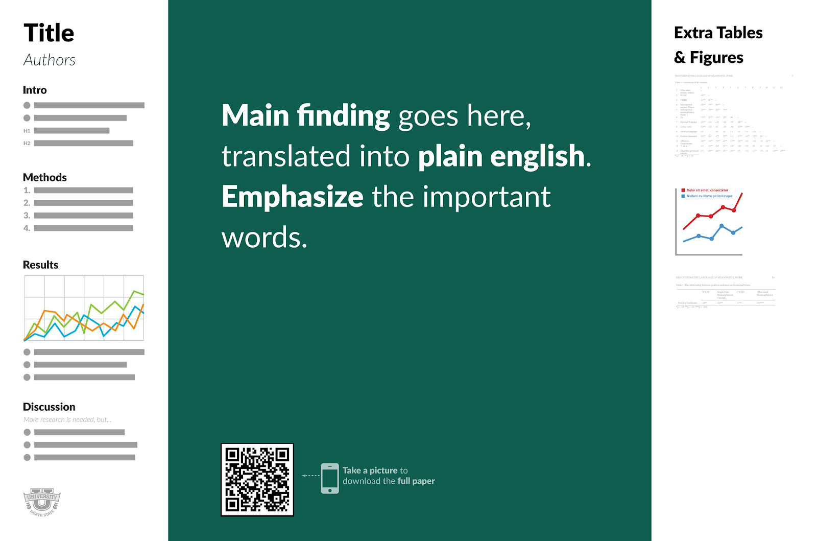
First, opinions on what constitutes good poster design differ. For example, this poster style:
It’s effective at communicating a main point! But honestly, I don’t groove with it, and I really dislike any push for “standardizing” design (this is why I absolutely dislike Biorender). So, there’s a lot of subjectivity. However, personal biases aside, I think fundamentally good poster design is based on these criteria:
It says what it needs to say and no more.
It makes it easier for the audience to interrogate your work
It has a visual style where the aesthetics serve to make your work stand out and attract people to communicate.
Also, I believe posters are not meant to be stand-alone at all. Posters, to me, are visual aids to assist the speaker. This must be said because I think how you approach posters (stand-alone versus visual aid) will influence the design.
1. Good design is only possible with substance
I’m not saying, “A poster with horrid design is bad science,” because I have seen fantastic projects with less-than-stellar aesthetics (generally guilty of huge walls of text and very tiny fonts). I think, however, that you can’t really "good design" your way out of a bad foundation as people suggest. In other words, you can’t really style your poster to have substance. In fact, good design should reveal if your project is lacking.
Ultimately, good design improves clarity and hones what you are trying to convey to the audience. That clear message, shaped for your audience, requires that you understand: (1) the theoretical foundation on which your project is based; (2) what to focus on, because extraneous details muddy the water; and (3) to rely on less visual clutter or crutches, you need to be on top of your project to be able to answer your audience’s critiques. I think there’s a common fear among grad students that by not including all figures, you’re being purposely shady. But the thing is, posters are not the currency of academia. Papers are. Posters are the previews!
2. It is easier to point out flaws with good design
The basis of all scientific research is that it can be critiqued by your peers. Every time someone comes with advice on their poster, I say, “Cut, cut, cut.” Yes, those equations are important for describing the work, but are they all necessary? I do a lot of mathematical modeling, and I’ve got to be honest: even I tend to skim very quickly. Like the majority of people, I need a pen and paper to think about it. Generally, if your theoretical poster has a lot of equations, it can (and should, in my opinion) be replaced with a schematic if possible.
In no way am I saying these posters are hiding something nefarious. One could argue that by removing the equations (I’ve had a lot of good debates about this), I’m somewhat “cheapening the science.”
Frankly, I think most people don’t really interrogate the equations as much as you might think at the poster session. Now, if there is a very important modeling assumption, you should include it. But here’s the point: by not including everything, you’re focusing only on the truly important things that matter. And that helps you get critical feedback on the structure of your research.
“Because you clearly laid it out, why did you use this FUNCTION for this PROCESS?” an audience member would ask, and that is good for science.
3. You are competing for attention
If design isn’t important, why is the rest of our life inundated with it? After the gym, I head into my grocery store to grab a protein bar; there are so many! My eyes dart from the brightly colored wrappings to the names. If the protein content is the same, I tend to pick the design I like.
Poster sessions are as crowded as a weekend at Wegmans. You have hundreds of posters lined up. They are never spaced far apart, and the attendants are bumping into each other. It’s loud. There might be alcohol, which helps. The poster presenters are all yelling to be heard over the din. You’re fighting for attention because, a lot of the time, people go to poster sessions to meet up with friends before heading out for dinner. Some people read abstracts before the poster sessions, circling which posters they are going to. Others (me) just head to the poster session, drink in hand, going through the series of posters, only stopping if something catches our fancy.
Being a successful scientist is being able to communicate your work. But to communicate your work, you must get an audience! Good design can attract eyes. Good design can make people remember your work long after the conference is done. Which leads me to my final point…x
4. Good design shows empathy
There’s this fantastic website that I was reading called BUTTERICK’S PRACTICAL TYPOGRAPHY. It’s an introduction to typography. It seems very niche, but the author makes a wonderful point about attention:
Attention is the reader’s gift to you. That gift is precious. And finite. And should you fail to be a respectful steward of that gift—most commonly, by boring or exasperating your reader—it will be promptly revoked… Once the reader’s attention expires, you have no chance to persuade. You’re just giving a monologue in an empty theater.
To have someone attend our poster is for someone to engage with our work. No matter how much of a hotshot you are, one should be grateful. There’s a lot of science happening, and to discuss something pretty niche? Good design understands that the audience needs help in maintaining attention. As Practical Typography suggests:
Good typography can help your reader devote less attention to the mechanics of reading and more attention to your message. Conversely, bad typography can distract your reader and undermine your message.
In the same way, good design helps your reader. There are many things I appreciate about someone:
A large title so that I can gauge if I’m interested in it from a distance.
Readable text from about a foot away.
Consideration of the way our eyes naturally flow.
White space to help my eyes.
Modified figures to help focus on an element.
These aspects seem minor, but they tell me a lot about the person. They care about communication. And when you care about communication, you are also opening yourself up to critique. This tells me that this person cares about the science being right.
Outro
So this generally applies to graduate students, who make up the bulk of the poster sessions. Time spent figuring out a good layout and design is a worthwhile effort. You’re going to make silly mistakes (I’m going to have a post discussing mine), but this is not just about substance or style. It’s about style and substance.