A design critique of my research posters
This was a post I made in my more professional work blog, but my adviser told me when you're on a job search, you shouldn't be shitting on your work. Fair! So I took it down. But I love looking back at my design choices. I'm very proud of these posters; I think they're very eye-catching and simple (The dynamics are very complex I wanna saY). As an aside, I think having an eye-catching poster is an important part of a research poster. For most conferences, you are sharing space with a lot of other posters, and people are generally going around with a drink in hand. I just love coming back to my design and being like: "This worked... But this didn't work! Holy shit what was I thinking"
These are two posters of the same paper:
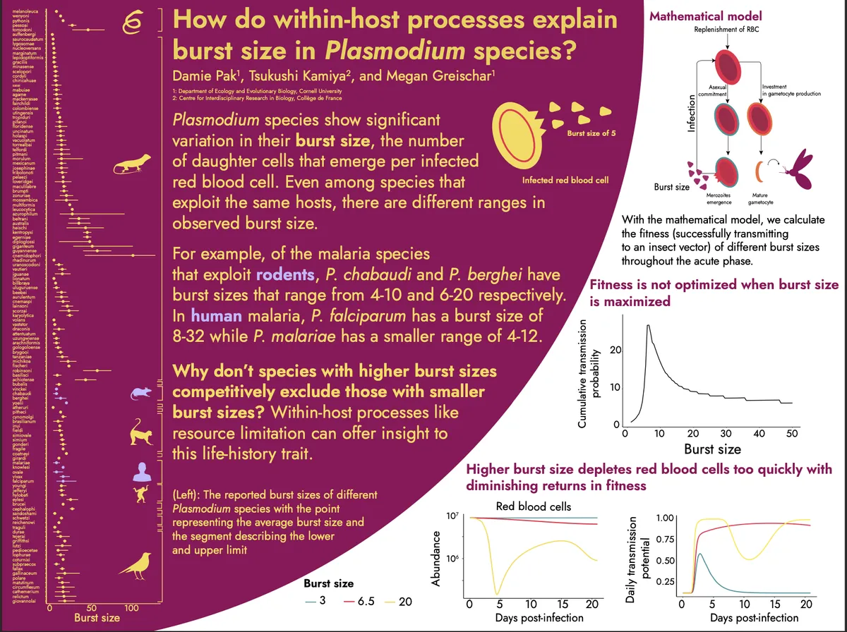
2022

The color palette I was going for Megan Thee Stallion's Hot Girl Summer because this conference was set in a hot summer (Atlanta, Georgia). I actually love the color palette, it's super vibrant when printed out! So a circle is a very bold design choice because it conflicts with the rectangle of the poster. It's part of why it's eye catching. The half circle is somewhat of a bolder design choice because now you have to deal with some weird partitioning. In the white part of my poster, you can see that the figure placements are super awkward. Most importantly, I think how the audience follows the poster is a bit confusing. Audience members will instantly go to the red partition and read the introduction. Great. But I don't think it's obvious you're supposed to go back up to the top-right corner. Your eyes naturally move to the right. I think that's why I would not do this design again. Design should help with understanding, and unfortunately I think my design somewhat hindered it a bit. Also yellow on white? God, what was I thinking!
But I tried something new and beefed up my Illustrator skill!
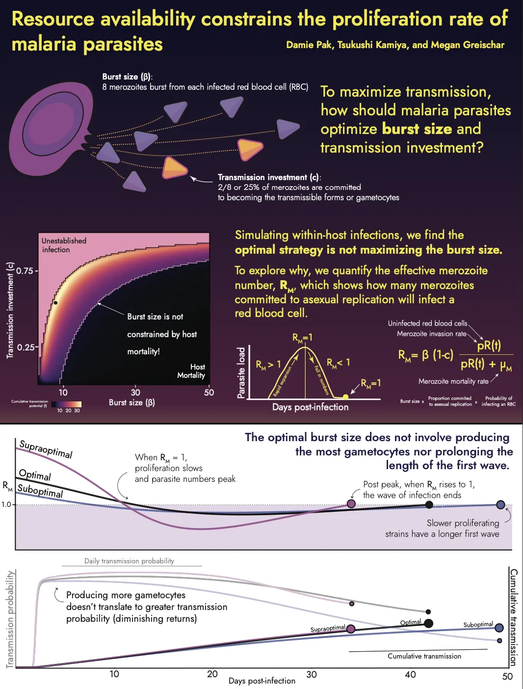
##2023

So my next iteration was this one. I did a more synth-wave color style. A lot more basic design BUT one rule I did break was by having a gradient background. Generally, gradient backgrounds on a poster are a no-no because they're super distracting. But I think I made it work by making it a loooot more subtle (I think you can only achieve this level of fine control in Illustrator/Gimp/Inkscape instead of Powerpoint). I'm a lot happier with the flow because the audience members know they read from left to right, up and down.
I think the part that I'm cringing is the wide figures on the bottom of the poster. In my mind, these big figures were going to make the poster eye-catching. Hilariously, my wife called these the "wiener dog plots" and advised me not to do that. I didn't listen. I thought larger plot, more understanding of the dynamics. But I think the figures are awkward and actually elongating the plots make the dynamics less obvious. The dip and rise in the curves, for example, look shallower. If I reduced the width, the difference in dynamics would be a loooot more obvious. Again design got in the way of understanding a bit.
So yeah learn from my mistakes:
- No yellow on white EVER!
- Generally, large circles on posters don't work ... I think if there's a narrative punch to it, sure. Anything with cycles. But honestly, working around a circle just suck if you have rectangular figures.
- Long figures make your dynamics and trajectories less obvious
- If gradient is subtle you can have it in your poster and it won't look garish